In this issue, I will share some data visualizations that I've been really digging for the past couple of weeks. Let's go!
The Dataviz Process w/ Shirley Wu
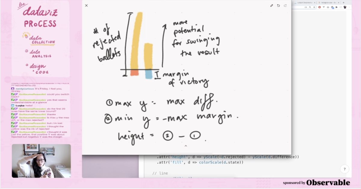
Shirley Wu is an award-winning data visualization expert. I shared a Pandemic data visualization game she and others released way back in Issue 7. Shirley has been streaming her process while working on an election voting ballot project. She typically streams Wednesday and Friday from 10am to 12pm PST. You can also check out past streams on her YouTube channel. She shares the good and the bad; the wins and the frustrations. If you're interested in data analysis and how to go from a hypothesis to data visualization, you want to watch these videos or join the streams.
Shirley Wu's Twitch Channel Shirley Wu's YouTube Channel
The Uber Game
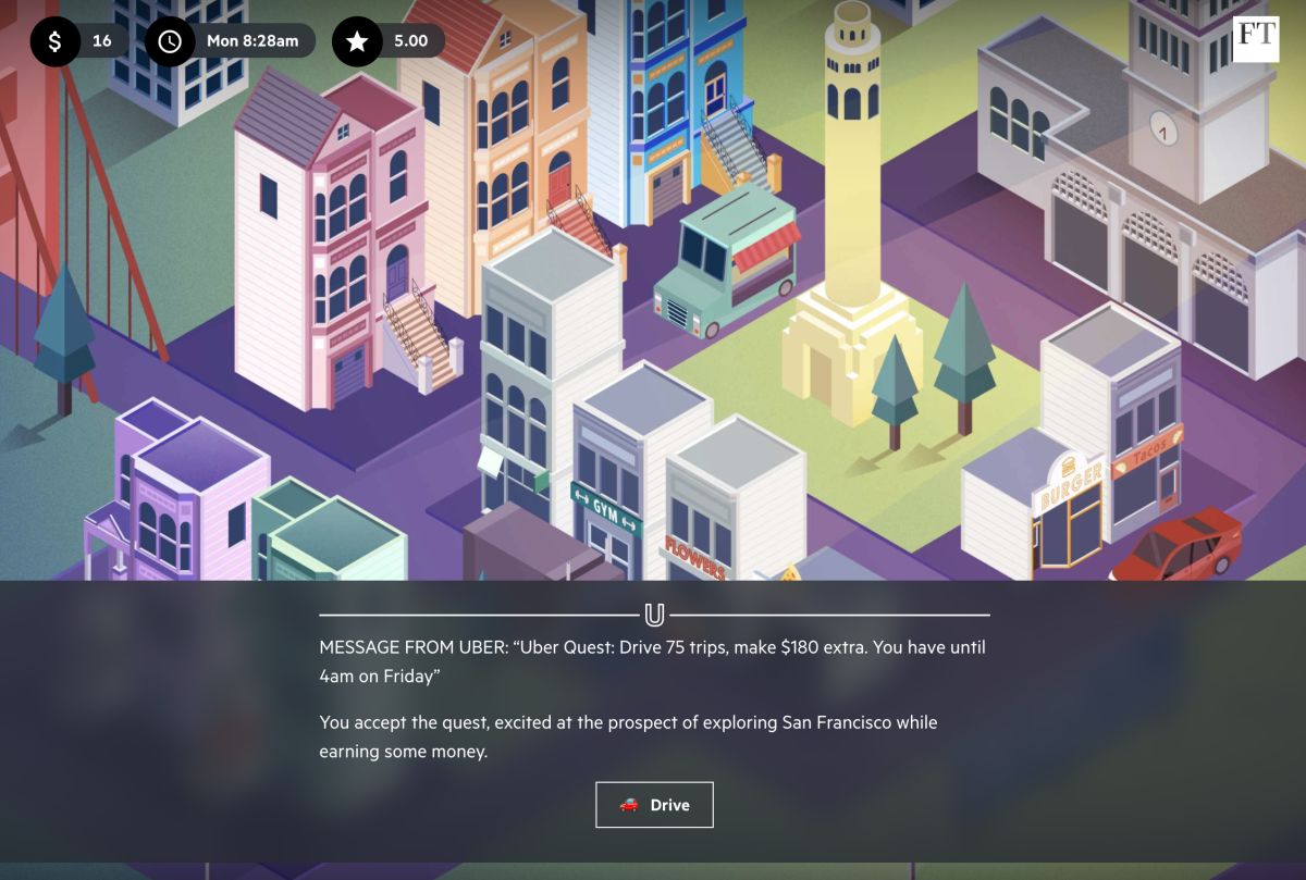
The Financial Times released this data visualization game. It took me about 5-10 minutes to get all the way through. You decide what you want to spend money on and who you want to pick up. While it's simplistic and may not take into account many factors, it's insightful nonetheless.
The Punishing Reach of Racism for Black Boys
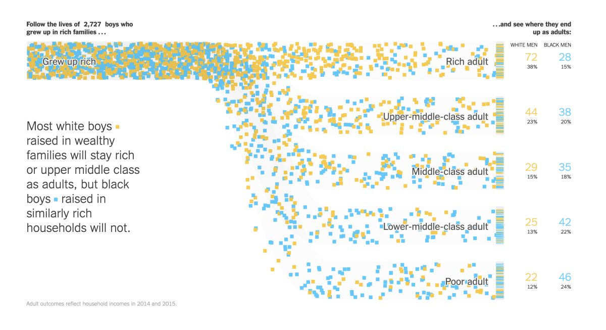
This article is a compelling data analysis by The New York Times that follows many boys' lives, black and white, rich and poor. It's a long but worthwhile read.
Extensive Data Shows Punishing Reach of Racism for Black Boys - The New York Times
The Gyllenhaal Experiment
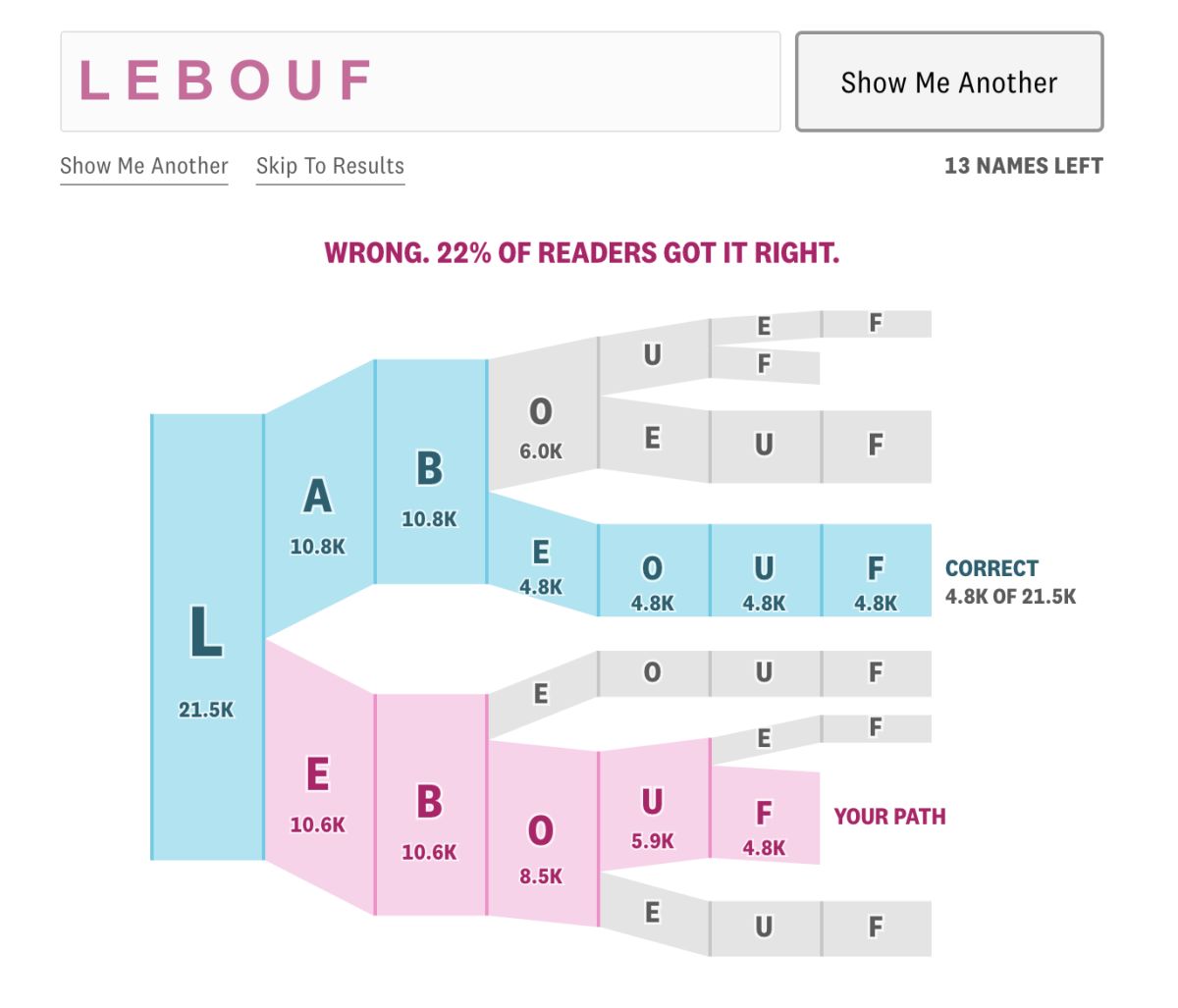
Named after the famed actors, test your skill on spelling difficult things and see how you compare to others. The image above shows how I did the spelling for "Labeouf." Don't judge. 😄
